Fashion website redesign • A UX case study for Shivan & Narresh
Experience Design for the Online Retail of Luxury Fashion

🙋🏻♀️ Hey you!
Glad that you stopped by.
I’m Natasha Srivastava, A Delhi-based Digital Product Designer.
During a not-so-brief stint in marketing, I learnt the art of keeping business objectives in mind while designing for the user and owing to my former experience in Editorial, I had a strong grasp over fashion-centric visual design. These together, allowed me to pull off this project successfully.
_____
📑 Project Brief
Brand Shivan & Narresh
Goal Redesign the website to streamline UX & CX with special attention to responsiveness + Integrate the site in line with digital marketing strategies, using social media engagement to drive sales
Let’s be honest, no matter how well-designed, a website ALONE has never in the history of the world, impacted sales. The idea was not to redesign the website in isolation but to create a strongly linked ecosystem to unite the web & digital marketing + sales & merchandising teams; to identify & meet user needs, as a result, maximise product sales via digital mediums.
Role Lead Communication Designer (UX & Digital)
Assisted By Graduation Project Interns — Payal Das & Vidhi Joshi
Constraints: Low budget + Short Timeline
Minimal change permitted in the design language
Advised to avoid drastic changes unless necessary.
🤓 The Nudge
I self-initiated this redesign after a year of working on the brand’s social media — monitoring it’s content reception, designing IG campaigns & handling it’s alignment with web strategies to facilitate sales.
Shivan & Narresh is renowned for its phenomenal social media presence. Instagram served as the most convenient way for the brand to interact with its people. Most often, DMs turned into direct conversions. The DM’s, in fact, triggered the idea of a redesign as the website simply paled in comparison. Mainly because it failed to provide a unique, easy and engaging experience for people to discover products and shop for their unique needs. Being aware of its immense potential, I realised that an experience-centric redesign would be an exciting challenge to take on.
🙈 Sneak Peek (Spoiler Alert)
I’m no stranger to tedious case studies and while I’ve tried my best to make this one interesting, I will not hold you hostage until the end.
This strategic redesign allowed us to do the following
• Include product discovery and usage in the web content
• Provide an easier online purchase experience
• Introduce touchpoints for quick action amidst dynamic storytelling
• Streamline web architecture & give way to easier interactions
• Connect with a diverse audience via more human representation
• Create an aesthetic interface strongly resonating with the brand image
TL;DR Alert Proceed with will & patience to get to the closing of this one. And maybe, a cup of coffee? Scroll down to view the process & design👇🏻

🌊 About The Brand
SHIVAN & NARRESH — Pioneers of Luxury Holiday Wear in India
Imagine diving in an expanse soothing blue waters or simply flaunting your beach bod in vibrant swimwear by the sun lounger; think cocktail brunching in a breezy, luxe resort outfits on your friend’s destination bachelorette; India’s first luxury holiday wear brand, Shivan & Narresh envisions one-of-a-kind universe, dipped in the expanse of pure luxury, in ensembles and experiences.

Shivan & Narresh as a brand does not sell clothes, it sells the idea of a luxurious, Instagrammable holiday experience.
Shivan & Narresh operates via its stores in Delhi & Bombay, Headquarters in Gurgaon & globally through Instagram & its website — the digital flagship.
🛍️ Online Shopping Ecosystem
The Business of Fashion & Luxury, Digitalised
Luxury is never just in the product, it is in the experience. Since forever, luxury shopping had been envisioned only as a tangible experience amidst a hoard of Greek-god attractive store consultants, halo-ed product displays and dreamlike retail spaces. But with the rise of technology, accessibility & millennial shoppers with their smarter, dynamic lifestyle choices — the digital marketplace witnessed an axis tilt in the online sale of luxury goods.
Today’s tech-savvy millennials with very little time to spare are more than comfortable with indulging in the online purchase of high-priced goods that tap into the realms of quality and authenticity, backed by genuine storytelling.
🛠️ The Need for A Design Intervention

💡 Despite the existence of a website, if people prefer to order via IG DMs, it’s safe to assume that the website isn’t working the way it should.
The existing website failed to do justice to the brand’s vision and its ideology of experiential holidays and travel. It looked like just another e-commerce platform, offering zero user engagement — followed by an absolute lack of informational and aspirational content even though the products are extremely niche. The following were among the initial observations that inspired the redesign.

Using mind-mapping, I outlined everything about the brand with an intent to highlight and structure where each fits in the story. I derived the aspects missing in the current version of the website. Meanwhile, also concluding if the ones present are given the correct space and focus. A major chunk of things missing is listed below.
• The campaign video is an aspirational addition that is not featured
• Celebrity, influencer and media coverage is not prominent enough
• History page shows no history and is hard to understand
• No space for engagement, guidance or awareness
• No education of the use, adoption and styling of the curated products
• Website is not responsive even though 75% of visitors use mobiles

🚶🏻♀️Understanding the SN Clientele
I got the opportunity to silently observe customers in the store. Watching people in their natural habitat, under no pressure influence, unaware of being monitored, was a golden opportunity to collect accurate insights into user behaviour, needs and pain points. I also had direct access to studio appointment–related information. These, coupled with the gathered insights set up a strong foundation for the structure of the new website.

📝 Research Insights and Data Analysis
Most of the research was based on the website’s Google analytics, insights extracted from the reception of the brand’s Instagram content, analysis of customer behaviour and sale patterns from the in-store interactions and personal appointments at the studio along with targeted interviews done with the merchandising team.


These helped in
- Identifying the kind of people who frequently visit the website and the way they interact with the product and the collection
- Recognising valuable visual content that is best received by followers
- Pinpointing the most popular products, the easy off-the-rack sells and the demands for more customisation and styling guidance
👩🏻💻 Audience Segmentation
I broadly categorised our luxury shoppers into three segments
- The first, people who live a sumptuous life filled with travel & recreation and possess enough capital to splurge on luxury — Lavish Spenders
- Followed by those that have lesser but significant disposable income to occasionally spend on luxury goods — Opportunists
- Then the aspiring luxurists who may be in the early stages of their career or from distinct geographies that aspire to be in the luxury segment — they may or may not be customers but possess enormous future potential and if targeted correctly, can be retained to indulge later — Aspirationalists

📇 Personas of Potential Customers
Using the above segmentation, I developed 4 distinct personas from the ‘Lavish Spender’ segment primarily because it represents most of the brand’s customers with purchase potential. Deep diving into their lifecycles, preferences, shopping goals and practices were essential to design a website that works for them.

Kabir represents the SNMan, as the brand likes to call it, Shanaya represents approx 18% of the brand’s audience, Nainika represents a larger 30+% (the kind that not only shops for herself but also requests outfits for twinning with her kids/spouse/siblings) while Sunaina represents over 20% of the clientele.
🏖️ Mapping Shanaya’s Online Shopping Experience
Following user segmentation and personas, I created scenarios and user stories for each persona. The example below, inspired by a real scenario the brand dealt with, illustrates a scenario in the life of Persona II: Shanaya. Her user story is focused on shopping online for a trip she’s taking to Goa, to attend her friend’s bachelorette.

Equipped with the understanding of multiple such scenarios for our personas, I could gather their unique requirements and what they need from us. Thereby enabling us to make validated decisions about how we can meet them halfway with our design and directed flow.
📌 Key Takeaways
Apart from making the website synchronous with the brand ideology, based on the above findings, summarised below are the most substantial opportunities I outlined for the redesign:
— Introduce action buttons that connect the website holistically
— Add styling guides, make it easy to purchase complete looks
— Facilitate quick contact via IG DM, Whatsapp, Phone & Email
— Allow users to book personal appointments with the designers
— Redefine checkouts, integrate auto-emails to share order updates
— Add content that increases product awareness & usage guidelines
🪄 Design Solutions
Problem: 50% website visitors are aware of the product offerings but are not aware of the brand’s distinct terminology
Solution: Shop Landing Page
The brand offers niche products, with not-so-familiar terminology like Maillots, Pareos, etc. The ‘shop by print’ option doesn’t add much value unless users know exactly what that print looks like. A landing page with visuals + links to shop prints and products make the discovery experience simpler.
Product Detail Page was also redesigned to accommodate a complete look via “Wear It With” and options to buy the same style in different prints/colours.
Problem: How do we tell customers that they can use SN pieces in versatile ways on vacations, parties and festive events?
Solution: Art of Holidays
Art of Holidays was a signature IG campaign that was later translated into an IGTV video. It was included in the product packaging as a tiny printed book, consisting of illustrations of the different cover-ups and ways of tying them up, to create multiple looks. I translated the book into a directly shoppable web page with snippets of the IGTV video.
Problem: Products are very niche and not wildly popular. How do we educate users about product use, styling and effective adoption?
Solution: Lookbook
A lifestyle page + style guide that walks people through the latest drop collection by displaying and describing the print, emphasising the best pieces of the season and their multifunctional uses via complete, styled looks split into Holidays, Resort & Celebration Wear.
Problem: Everything looks great on a model in a staged photoshoot, how do we show real people what the outfits would look like on the real, imperfectly perfect bodies?
Solution: SN Conoisseurs
Real-People, Real Holidays: During a social media campaign, a picture of a famous plus-size make-up artist flaunting S&N swimwear almost broke the internet. The brand celebrates all women and specifically, the bold, Indian women. That campaign was a Eureka moment where I realised the power of showcasing real people. And hence came about SN Connoisseurs, a place where the brand can share user-generated content.
Problem: Being a luxury brand that caters to aspirational, lavish experience hunters, how do we show those people that celebrities & influencers constantly flaunt the brand’s pieces?
Solution: SN Celebrities
Celebrity coverage adds massive aspirational value as you get access to a famous person’s wardrobe. It increases user inclination to buy and establishes faith in the brand’s ideology
Problem: Users see news + updates of every collection, collaboration and what-not on the blog, but what do they do with that information?
Solution: Shoppable Blog Page
S&N has an active blog page that talks about the making of a collection, the show, store collection, collaborations, events and everything else in between. It started with the question “Once people have seen all these images and news, what do they do? And if they wanna buy something they saw there, how do they find it?” Answer: Shop This Look
🪧 Information Architecture
Peter Morville and Louis Rosenfeld in their book ‘Information Architecture for the World Wide Web, 3rd edition’ explained that IA needs to address four main types of user needs. In the context of Shivan & Narresh, those are:
- Known-item seeking: Lavish Spenders People who know what they want like the latest drop collection, an outfit they saw on an influencer, or want to reorder something possibly in a different colour or print
- Exploratory seeking: Opportunists People who’ve seen the looks floating around on several people/celebs and want to find similar styles that could work for them
- Exhaustive research: Aspirationalists People who are aware of S&N on the surface level. They know it as a premium, larger-than-life brand but aren’t very sure of the product range or pricing which might or might not be in their range/taste. They will conduct an immersive search to find as much as they can and will keep the brand in mind for future purchases.
- Re-finding: Lavish Spenders + Opportunists Might have wishlisted a product or ordered it previously and would come back looking for the same/similar products.

The navigation was strategised on the principle of providing a home page aimed directly at Lavish Spenders, top navigation that would satisfy the Opportunists, and exhaustive footer navigation to allow Aspirationlists to deep-dive, with minimal effort on their end.
🗂️ Page-Wise Content Inventory
Done with the information architecture, following the addition of new pages, I revisited every page from scratch, adding relevant content to all.

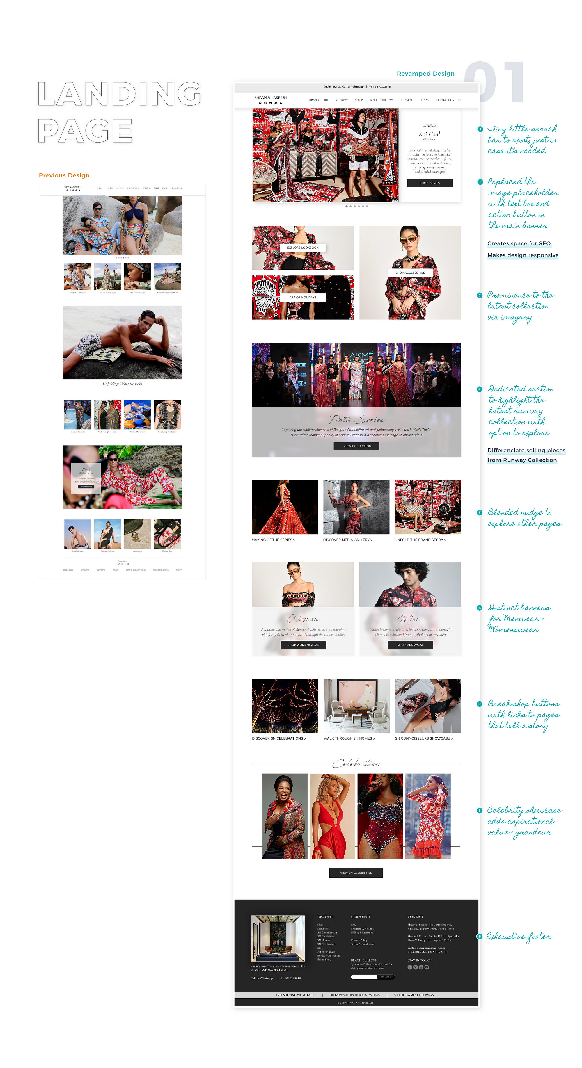
🎯 The Redesign
Here it all comes together. I’ve illustrated the conception of the landing page in excruciating detail and shared designs of the few other pages I added.
Note When it comes to luxury shopping, prominent clients only buy what’s new and the latest. Shivan & Narresh releases a new print every 30–45 days as their drop collection and the store/social/website display changes to highlight only the latest print while others are available in the shop section.


Credit Note The UI design for Lookbook was done by Payal Das and Art of Holidays was designed by Vidhi Joshi as part of their Internship Project.
✨ Reiterating: Major Changes + Innovations
- Shop Landing Page + Shoppable Blog Page
- Runway page with button to Pre-Order show looks
- Exhaustive footer + Profile, FAQs & Help Section for assistance
- Product Detail Pages with ‘Similar products’ & ‘Style it With’ sections
- Lookbook: What, When, Where & How To Wear + Shop Links
- Art of Holidays: Brand philosophy translated into a shoppable lifestyle page
- SN Connoisseurs: User Generated Content. Real people, real holidays
- Translated successful social media campaigns into web content
⚖️ In Conclusion
In today’s digital spectrum, it’s not products on pedestals anymore. It’s about the larger story and context too. Shivan & Narresh is more than ensembles, the brand goes beyond fashion and luxury. It revolves around the ideology of luxurious holidays and the aspirations of travelers who seek unique experiences. It pioneers the inspiration, the motivation to travel more and live the best possible life one can.
With a goal to bring out the holistic lifestyle reflection of the brand and its ideologies to life in the website, I intended to make shoppable products easily accessible along with the story of the brand and its connoisseurs, intricately woven all around it.
📈 Launch & Reception
The website was soft-launched in the last week of April 2019 and marketed in the first week of May. The statistics improved considerably immediately. The launch was also emphasised via an Instagram campaign which softened the blow of the redesign and allowed people to understand the changes in the interface and their advantages.

Ideas in the pipeline for the future of the website
1. SN Trolley: Another brand campaign that serves as Holiday guide
2. Product Filters
3. Shoppable, actionable editorial SN magazine instead of the Blog
⌛ Revisiting The Design, 2 Years Later
During a recent presentation of the designs, I was asked a lot of questions about my decision-making and visual design choices. Two of them stood out in particular:
- How would the end product be if I had absolute (not unreasonable) creative freedom? What if I had high-end development resources and I were free to try and evolve the design language, the design system, the overall visual aesthetic— what would the website look like?
- Revisiting the site from the point of view of a Designer not a part of the brand, if I were to re-evaluate and update the design today, what changes would I make?
I kinda tried that out 👇🏻

It seemed like an interesting thing to try out cause, primarily, a design is never complete, it can always evolve. And those two questions pushed me into a lot of creative soul searching.
I think it turned out pretty spectacular. Obviously, two years’ worth of time makes you a totally different designer, possibly unrecognisable by your past self. And if I’m being honest, the growth and evolution kinda makes me super proud. But there's also the fact that this design bears no resemblance to reality and was done by defying most rules set up by the developer/brand but hey, it’s a personal project, after all :p
Cut me some slack and appreciate the work. Please?
If you’ve reached this point, I absolutely love you and applaud you for your patience. Much grateful. Drop a line in the comments to connect and ponder over design or life. Thanks and see ya!
